Logo
The logo consists of two combined elements. First, the custom “T” icon has been designed to represent circuit board connectors. Second, the Wordmark which is built on the Interstate font (see Wordmark section for more on this).
Structure
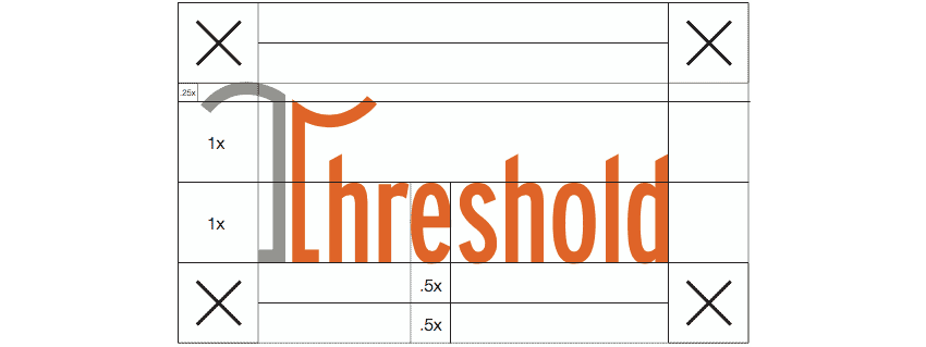
A clear area around the logo will insure it has maximum visibility and impact on every communication. Avoid crowding the logo with other graphic elements such as typography and imagery. As illustrated below, the height of the “e” character has been chosen as “X”, the standard unit of measurement for calculating the clear area.
Print and electronic media
Keep the clear area to each side of the logo equal to or greater than the “X”. Follow this standard for all media except signs, banners, etc.
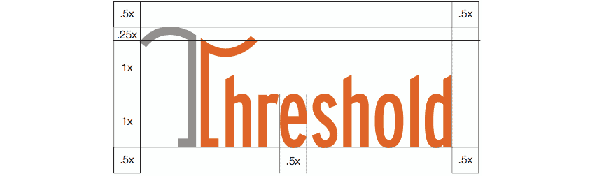
Clear area for signs, banners, etc.
Reproducing the logo in sign applications often requires more flexibility. For banners, building facades, directory signs, monument signs, etc., provide a clear area equal to or greater than half (.5) of the “X”.
Color fields are used to highlight headlines, frame the visuals and increase the stopping power of a communications piece. When choosing colors, select those that complement the key visuals for greatest impact. For added emphasis, colors from the palette can also be applied to type in solid or tint. Tinted color fields can be used to highlight areas of a piece that contain special information.